A NEW LOGO, THE SAME PASSION.
2021 will be a very important year for SOME. Our Company reaches the important milestone of 20 years of activity, during which we provided Consultancy and Software in the Financial and ERP fields, always guaranteeing a high level of professionalism both in Italy and in international contexts.
There will be several innovations that we will present to our customers and partners. The first of all, which we are pleased to introduce to you thanks to this article, opens a new phase of our company: a complete renewal of the brand identity, a new logo that projects SOME towards a current and modern image.
Our logo symbolically translates a natural evolution of our world and carries within it the corporate values that have always distinguished us, moving into the future with a more captivating language.
To best represent the reality of SOME and the commercial environment in which our company is located, we have created a brand with solid shapes but at the same time fluid and capable of adapting to different contexts of reference: website, social network channels official, traditional letterhead, web magazine and traditional media.
The essential lines of the geometries that characterize this new expression of the SOME brand summarize the previous shape of the world in the roundness of the letters O and M: the latter becomes the symbol of the merger with important international partners and of the strong relationship that we have with our customers.
SOME is renewed, integrating all its realities in a single, fresh and contemporary sign.

SOME – SUITE OF MANAGEMENT ELEMENTS
THE TRANSITION, BETWEEN UNION AND IDENTITY: THE SEAGULL
Today, therefore, the perfect transition from a traditional logo to a modern and "responsive" one becomes a reality: a new brand born to the future and able to adapt to every positioning need, ready to the new rules of social communication and web, which presuppose simplicity and speed of recognition.
This characteristic can be seen in the simplification towards a unique sign, in which the brand merges with the lettering giving life to a new and harmonious shape, a real signature.
This becomes the key to the modification itself: the approach of the concepts of “the world” and of “the partners” under the key of interpretation of the typical sign of the reality of SOME.
This M which now, in the graphic version, we have approached the idea of "seagull", a strong and distinctive element that will guide and will characterize the logo in the various pages and will denote the declination of the various partnerships to which SOME is linked, using the relative colors to strengthen the concept of union.
Union of several worlds and world itself.
The one in which SOME wants to express all the enthusiasm and competence that have distinguished it in these years, ready to take on the new challenges of the future.
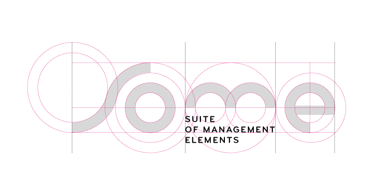
Below we would like to show the creative processing that led us to the final artistic choice: SOME is definitively projected into a new era, with the same passion as ever.

SOME – SUITE OF MANAGEMENT ELEMENTS
Genesis of new logo


